Discovering TV content for March Madness
Duration
3 weeks
My Role
I was the sole designer and led interaction/visual design and prototyping. I worked closely with our PM on defining requirements and our tech lead on implementation.
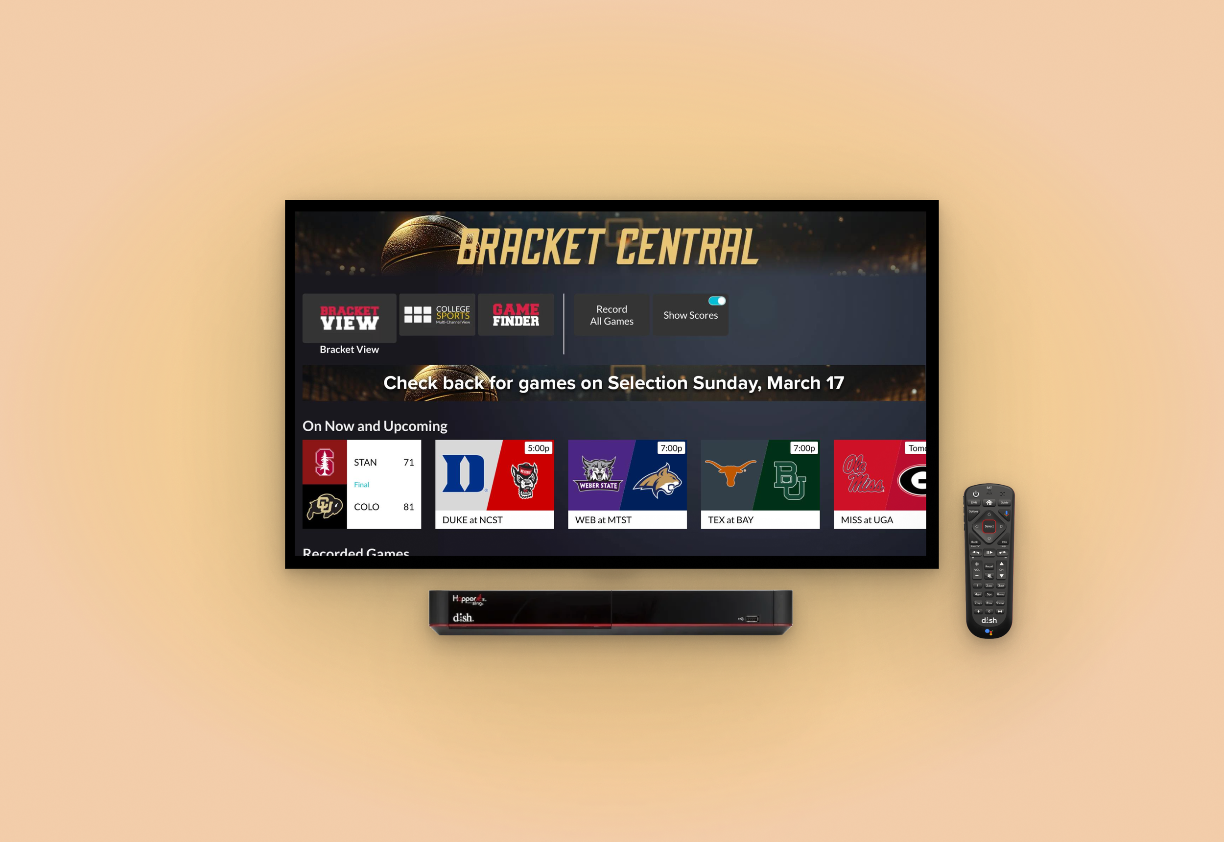
Final deliverable: the new Bracket Central app on DISH receivers
Context
Deliverables
DISH TV is a satellite TV provider. Sports is the #1 reason for subscription and March Madness is one of the biggest annual events for viewership.
While previous years’ experiences catered to fantasy players, this year we prioritized content discovery for casual fans and avid followers alike.
I designed an TV app for DISH receivers where viewers can discover live, scheduled and recorded games, view game statistics, and track tournament progression in bracket.
I created design and interaction specs and handed them off to the dev team.
Impact
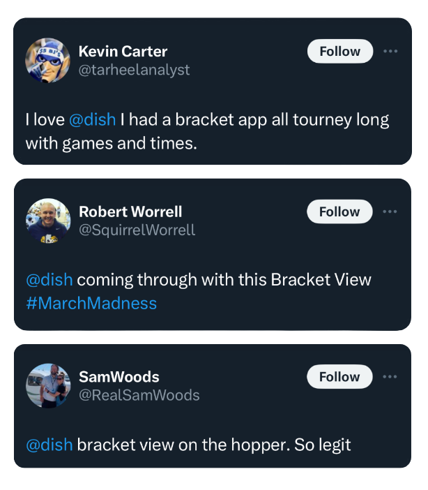
Used by 430K+ households which resulted in 1.5x usage and 2x engagement lift compared to previous years.
The successful rollout under the new Android TV software architecture also provided the benefit of faster load times, smoother transitions, and greater content access when the receiver is offline.
In addition, the app serves as a reusable template for future seasonal events, accelerating the release process.
Scattered broadcasting rights = Friction for fans
Through existing customer insights, we know that viewers typically find content by scrolling through the Electronic Programming Guide or writing down numbers of their favorite channels.
Given that broadcasting rights for March Madness are scattered across 4 networks, it can become hard to keep track of who’s playing when, on which channel, through a 3-week tournament.
The goal is to minimize the time it takes for viewers to tune in and support their favorite teams, and ultimately improve retention.
Negotiating old & new patterns
Showing sports-specific game details
Setting up recording
Our customer demographic of age 55+ tend of prefer a predictable, familiar experience. We were also dealing with outdated tech stack, limited engineering velocity and tight project timeline.
However, my PM and I were aligned that there were opportunities to address low hanging fruits in legacy patterns to tailor the UX to this specific context.
The existing Info Card’s cluttered layout wasn’t able to fit much relevant scores or stats for sports games. Unfortunately, there wasn’t enough time to implement something brand new either.
My PM, tech lead and I landed on the Game Finder as a viable option — an separate app with high DAU by sports fans. As it opens as a bottom sheet, some app context can be preserved. This also ensured that all scores and stats were called from the same consistent source and updated in real time.
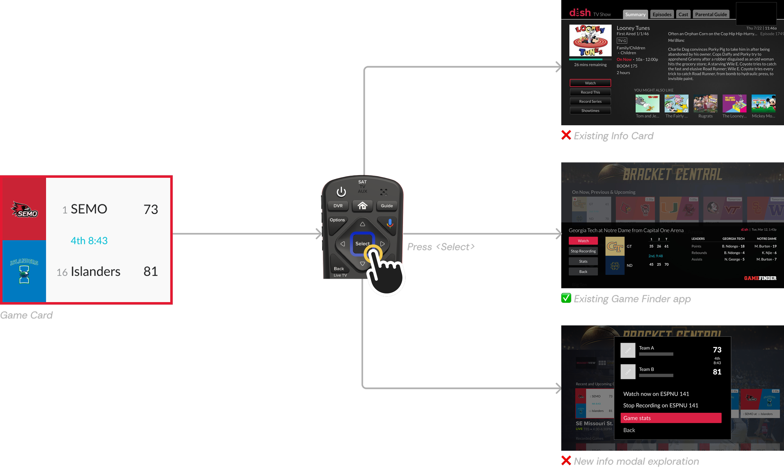
Typically, the Options menu is activated by pressing the <Options> key. This pattern requires excessive attention shifts between the screen and the remote. This would be an unnecessary cost for this app that had only 2 options/settings.
Surfacing the Recording and Score Visibility options directly on the screen should give them more discoverability.
Before
Accessing the Options menu requires excessive attention shift between the remote and the screen.
Exploration
Because both features are '“set-it-and-forget-it”, they should be immediately visible at first use.
After
Combining the only 2 setting available on the top shelf provides greater discoverability.


Navigating the bracket view
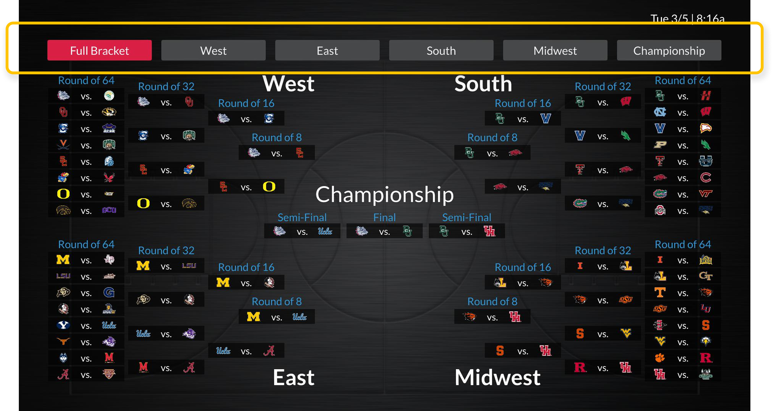
Even though DISH was not offering a bracket challenge this year, fantasy players were used to tracking tournament progress in the bracket format.
When testing the “Bracket View” prototype, I discovered confusion moving between regions with the remote’s directional pad. I got buy-in from my tech lead on a persistent tab-based navigation pattern that acted as clear signposts and reduced the number of key pressed needed to navigate between regions.
❌ Focused areas do not map 1-to-1 to the only 4 directions available on the remote’s directional pad, creating ambiguity.
✅ Focused areas do not map 1-to-1 to the only 4 directions available on the remote’s directional pad, creating ambiguity.
Stretch goal: Loading state
Since loading can take up to 7-10 seconds on older receiver models, providing a skeleton loader could help set up expectations for the structure of the app. While I designed a version that was meant to also be implemented on the DISH Android TV homepage, there was unfortunately not enough time to develop and QA all the variations required throughout different stages of the tournament.
Reflection
Through this project, I developed stronger judgment around making tradeoffs and recognizing when it is appropriate to break existing patterns. When implementing changes felt challenging, I learned to build the courage needed to identify and advocate for meaningful quality of life improvements. The breakthrough came from investing in genuine relationships with my engineers, sitting together in front of a TV and working through each other's constraints and perspectives. This collaborative foundation ultimately aligned us on the actions needed to achieve our shared experience standards.