Monthly payment calculator for used car shoppers
Duration
2 months
My Role
I led research, interaction and visual design. I collaborated with a researcher on research strategy as well as another designer on discovery and early concepts. I worked closely with engineers on delivery plan and visual QA.
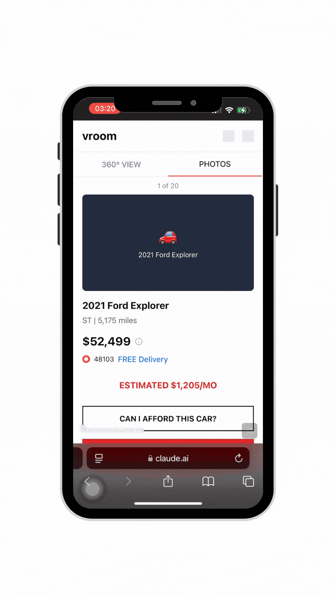
Final deliverable: the new monthly payment calculator on vroom.com’s Product Detail Pages
Context
Deliverables
Vroom is an online used car dealership offering a hassle-free shopping process. It had acquired an auto lender service to expand subprime customers’ access to credit with more competitive terms.
I joined the squad to explore strategic conversion opportunities in the upper funnel with the acquisition.
I designed a new calculator feature helping prospective customer identify and qualify for the loan terms that works for their budget.
I led kickoff and brainstorming workshop to align the cross-functional team on project objectives and scope.
I conducted 5 interviews + concept tests to understand car shoppers’ decision-making process.
I collaborated with the engineering team on the final prototype and specs.
Impact
This feature streamlines Vroom’s in-house financing, driving conversion, GPPU, and approval rates.
Flexibility early in the shopping process empowers prospective customers to make financial decisions that they know will work for their goals.
Imagine making the second biggest purchase of your life...
Completely online.
Sight unseen.
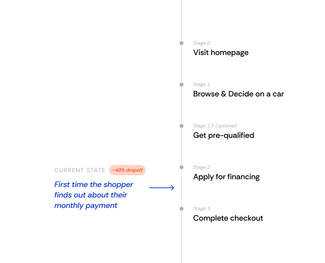
Shoppers lacked transparency in the financing process
From previous research, we had identified a key frustration:
Vroom shoppers are not confident about getting approved for a loan.
The lack of upfront transparency about monthly payment was causing Vroom to lose customers to other financial institutions and brick-and-mortar dealerships.
“I’m still left with entirely too many questions for my liking.
Maybe I fall head over heels with this car but I still don’t know… what am I going to be looking at as far as monthly payment.”
More than 1 in 3 Vroom shoppers are subprime.
Yet they are less likely to move forward with their loans.

HMW help subprime shoppers obtain loans that fit both their budget and their car needs?
Subprime shoppers are less likely to get approved for or accept a loan
Turning open questions into a clear product direction
I led the kickoff with PM, Engineering, QA, Data, and UXR to align on existing insights, identify remaining gaps around shopper motivation and behavior, and define key data needs. I also facilitated a brainstorm, inviting everyone to contribute ideas that directly shaped the product roadmap.
Considering technical lift, we prioritized launching monthly payment customization on the Product Detail Page (PDP), where it would offer the most immediate value helping shoppers structure loans per car and enabling smarter, budget-driven recommendations down the line.
Cross-functional workshop generated both short- and long-term ideas.
Developing the concept
Key design principles:
Convention. The interaction pattern and input fields should be familiar with other common loan calculators.
Clarity. There’s a lot of numbers to crunch here, so the visual hierarchy must facilitate easy understanding of the purposes of the fees.
Scalability. The components and patterns should be reusable for the next phases.
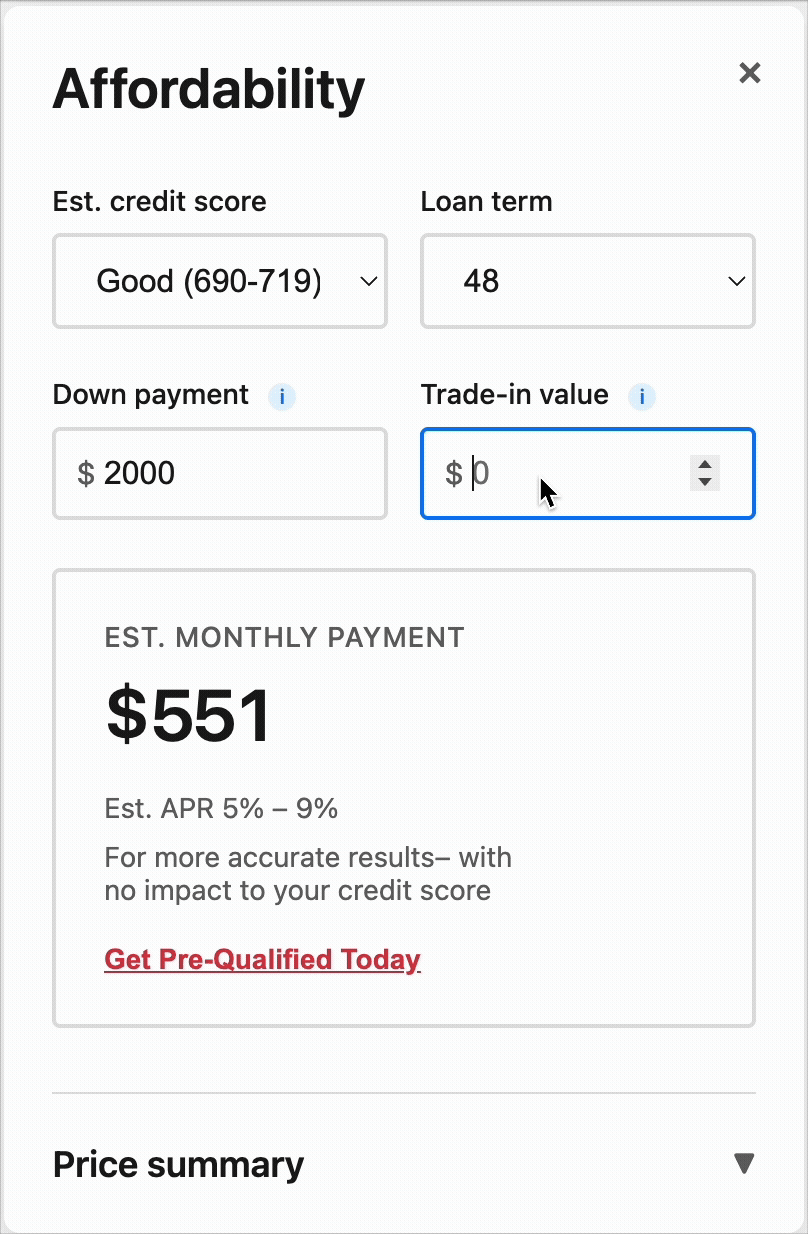
Iteration #1
The visualization in percentage wasn’t quite valuable and we’d run out of colors quickly.
Iteration #2
Added a receipt-style price breakdown to answer ‘what am I paying for?’.
The widget placement could get lost in all other important car info on the page and add to the cognitive load.
Iteration #3
A side drawer on desktop/tablet and bottom sheet on mobile. Can eventually evolve into a “cart” feature with stronger budgeting capabilities, where shoppers could also consider for protection products, insurance, gas, and so on.
Iteration 4/synthesized test concept
After getting early feedback on feasibility from engineering and critique from the design team, I built a prototype to get feedback from users.
Filling research gaps with a creative mixed-methods plan
Even though the feature seemed simple, our kickoff workshop revealed a big gap in how shoppers think about financing early in their journey. Since standalone discovery research had been tough to run, I partnered with our UXR Director to plan 60-minute sessions combining three methods, giving us depth without slowing momentum.
Short term
Q: Can we confidently ship this?
→ Concept evaluation — To test new interaction pattern and feature discoverability.
Long term
Q: What would a personalized experience look like for a subprime shopper?
→ Interview - To understand how personal financial contexts may affect shopping decisions.
→ Card sorting - To understand how all decisions related to a car purchase are prioritized.
Our research revealed that subprime shoppers were well aware of their financing limitations. But rather than feeling discouraged, they used these limitations to inform extensive tradeoffs between monthly payment, total cost, and features. This insight validated key design assumptions and helped shape strategy for a more flexible subprime shopping experience.

I asked participants to rank decisions factors by importance, and how these would change if they were on a tighter budget.
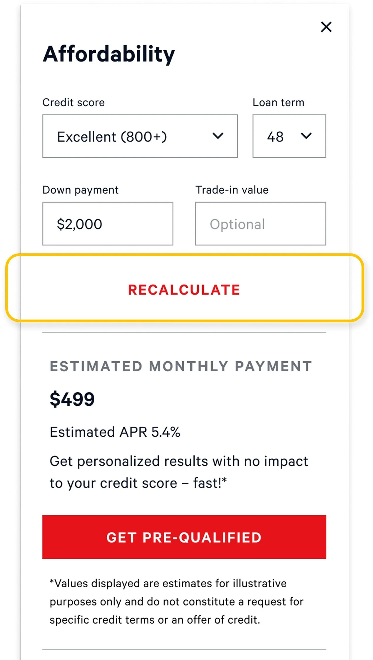
Balancing experience quality with performance constraints
As I wrapped up designs based on user feedback, engineers surfaced performance issues with real-time calculations. I partnered with them to explore alternatives and we aligned on introducing a “Recalculate” button for launch, deferring dynamic updates to post-MVP. It was a small tradeoff in fluidity, but it helped us move faster, learn from real usage, and stay ready to iterate.
Before
Results dynamically update
↓
API load and performance issues
After
Results update upon request
↓
Unblocked MVP launch and early usage data collection
Informative error handling for invalid term inputs
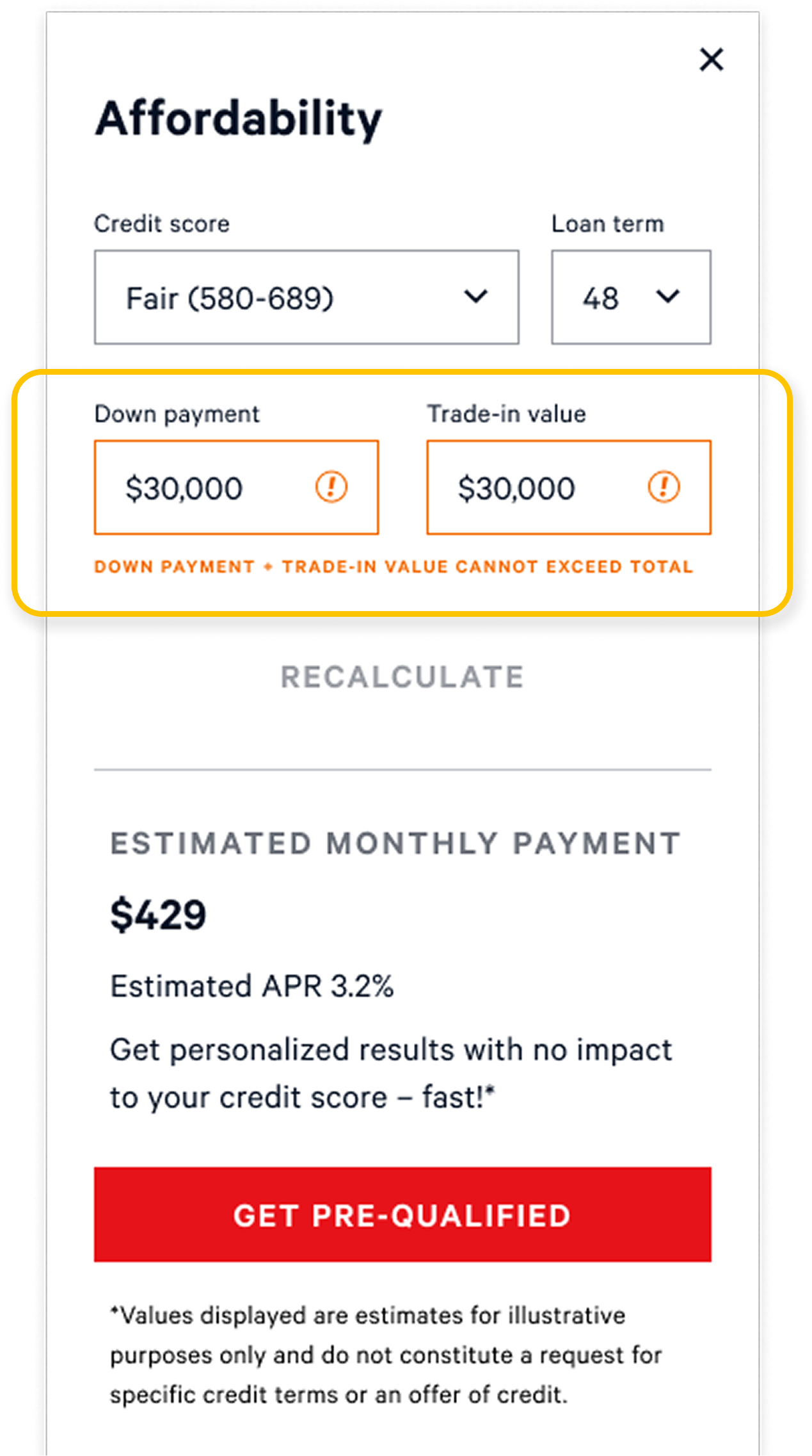
Some input combinations for down payment and trade-in value led to non-positive monthly payments which would be an illogical outcome for financing. I worked with our QA Engineer, PM, and UXR Director to decide on an error state that disables the “Recalculate” button and prompts shoppers to revise likely typos, helping them get back on track with accurate, meaningful estimates.
Before
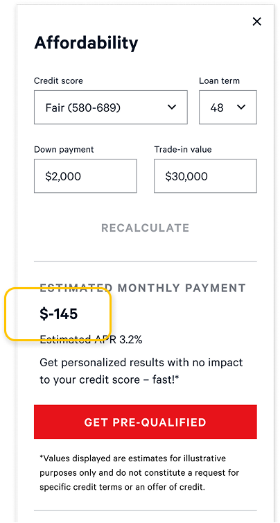
Monthly payment may return a negative value based on strictly mathematical calculations.
After
Consider this an edge case that’s more likely a typo than intentional, nudging shopper to enter value that would yield a meaningful result.
Setting up success with a clear A/B testing strategy
I strategized with my PM on the A/B testing plan and success criteria, with the hypothesis that shoppers with access to this feature would convert better to pre-qualification and start purchase.
Business metrics
Conversion to pre-qualification
Conversion to start purchase
Downstream impact (loan approval and acceptance rate)
UX metrics
Engagement
Adoption
Click map
NPS
Future work: Improving search relevance with monthly payment filters
Research revealed a strong shopper need for monthly payment filters to make searching cars by budget faster and more relevant. I collaborated with engineers to explore impact and scoped two phased releases, introducing progressive levels of monthly payment customization in the catalog filters.


I explored ways to leverage the new calculator feature as well as using representative/predicted presets to balance backend load.
Reflections
This project was a strong reminder of the power of research and user context. Designing for the subprime population required us to move beyond assumptions and focus on the control shoppers have in making financial tradeoffs, regardless of credit score.
I gained valuable experience bringing a feature from 0→1 in a fast-paced startup, navigating tradeoffs across teams, and learning when to adapt the process, make compromises, or push back. It sharpened both my judgment and confidence as a product designer operating in ambiguity.