Transforming complex nested layer structures in 2D design tools
Timeline
3 months
My Role
In a highly ambiguous and complex problem space, I collaborated with 2 other designers and led end-to-end design for 1 of 2 core features for a professional design tool. I led problem discovery, interaction/visual design, prototyping, and research strategy.
Context
Deliverables
I spent my Master’s Capstone working with an advisor at Adobe to identify opportunities to reimagine the layer paradigm in 2D design tools.
Based on research about the challenges of current layer management experiences, I designed and validated a novel Figma feature concept that transforms occluding and deeply nested structures. The new visual representations enhance interpretability and navigation, and I communicated the experience through multiple animated prototypes.
Remember when you picked up someone else’s Figma file? 😬
(…We’ve all felt the pain of deciphering what Frame 3784269 is, or trying to make a small change without breaking 10 levels of auto layout.)
Complex hierarchies are difficult to interpret through the layer panel
Displaying layers in an indented list format is inherently unscalable. Limited horizontal space, long, indistinguishable layer names, and the long linear list make deep hierarchies hard to navigate and interpret.
Designers are therefore forced to continuously divide attention between the canvas and the layer panels, resulting in cognitive overhead that interrupts momentum and diverts from creative time.


Our research found that renaming layers is often seen as a chore and only selectively done as required by collaboration.
HMW envision a more distinct visual representation of layers without enforcing unnecessary “conventions”?
A visual-first way to interpret deeply nested layers
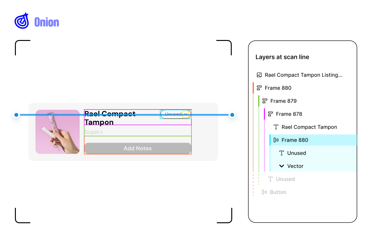
I concepted a novel Figma feature, Visual code, that visually exposes parent-child relationships within deeply nested structures directly on canvas.
Our team chose Figma Design as the product as it offered the richest opportunities: working with complex UI compositions and professional-grade features, as well as supporting collaboration with non-designers.
Building and validating frameworks for layer management workflows
Through observations, contextual inquiries, and interviews, I outlined 2 frameworks to help the team break down the ambiguous problem and align on key user tasks, goals, and requirements.
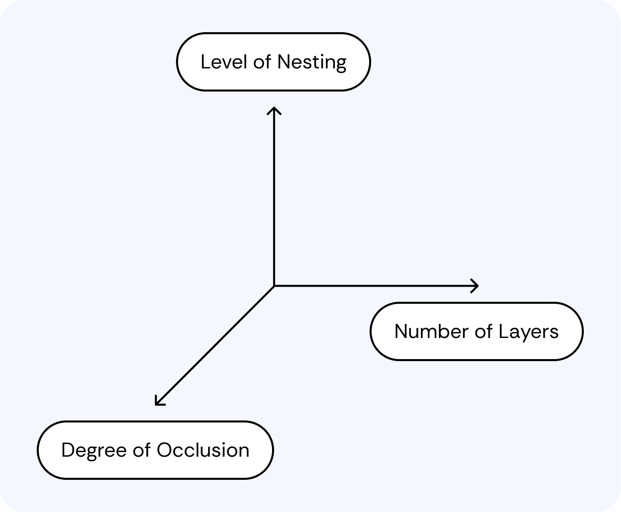
What makes a layer composition “complex”?

I initially hypothesized that "finding" a layer was required before “selecting,” assuming designers know what to look for. However, research showed most time was actually spent reconstructing or retrieving a mental model of the layer hierarchy, especially when (re)visiting unfamiliar files. This reframing helped narrow our focus.
Drawing interaction concepts from real-world layer analogies

From analogous research and observing metaphors in the real world, I was drawn to the idea of “slicing” a structure for cross-sections, inspired by CT scans.
Our focused goal was to facilitate understanding complex layer hierarchies through alternative visual representations that better align with designers’ mental model and spatial perception.

I rapidly prototyped a concept with Claude that scans a layer composition with the slider interaction. I liked its interactivity and how it supports understanding one “slice” at a time.

I shifted to explore scanning along the z-axis, but exposing all layers on a given “depth level” still didn’t feel valuable enough.
🧅
I called it Onion at the time because they have a lot of layers!
But as I built it out with a real mockup, it didn’t seem to fit to scan deeply nested frames by the y-axis. The scan line would technically intersect all parent frames, but rather than providing valuable context, that only adds visual noise.

I used color coding to surface context from parent and children levels for each depth level. The challenge remains in how to visually represent and navigate “depth levels”.
Scrolling in the deep
HMW visually understand and navigate the z-axis?

Early iterations referenced the conventional scrollbar. However, in concept testing, designers had a hard time understanding that it scrolls on the z-axis due to its convention.

We then explored incorporating perspective into the scrollbar to represent going “in” and “out” of depth, as well as emphasizing the discrete nature of “depth levels”. But there was ambiguity in understanding “forward & up = going deeper”.

Inspired by map legends and HTML ???, I pivoted to a map approach that visually resembles nested layers.

According to critique feedback, I changed the color slider to vertical to better match mental modal of layer hierarchy, removed -/+ controls to reduce ambiguity, and moved placement so it is part of the layer panel.
To layer panel, or not to panel?
Decision
Keep the layer panel but in a “trimmed” version; give it special treatment matching visual-first representations.
If the layer panel is not great with complex compositions, should we leave it out completely?
Rationale
While many designers are frustrated with the layer panel, some consider it a “source of truth.” Visual code can reduce reliance on it, and “trimming” it could avoid some scalability issues.
Impact
Designers can reference the layer panel and confirm layer hierarchy when needed, while relying primarily on the faster, visual-first system.
Plugin vs. Native

Native feature
Decision
A native Figma feature would be best at bringing the value of easy visual understanding into the full editing workflow.
Plugin
Where should this experiene live—Plugin or native feature?
Rationale
The plugin, although more feasible, couldn’t support direct editing on the canvas. Even though it could show hierarchy or isolate layers, deep selection and remaining adjustments still had to be completed in the editor itself.
Impact
Designers wouldn’t need to bounce between a plugin and the editor. Closing the gap between understanding and editing can also improve adoption.

Reflection
I had to opportunity to define and scope our project from a broad and complex problem space. We had to make ambitious decisions and difficult tradeoffs; but in the process of defending and revising these decisions, I learned how to best leverage business, technical, user, personal, and emotional perspectives.
I also pushed my creative boundaries reimagining interaction patterns that I’d grown used to and taken granted for as a designer myself. Defining the interaction and visual details so that they fit seamlessly into the existing experience, I got to introspect how my tools shape my mental model and workflow.
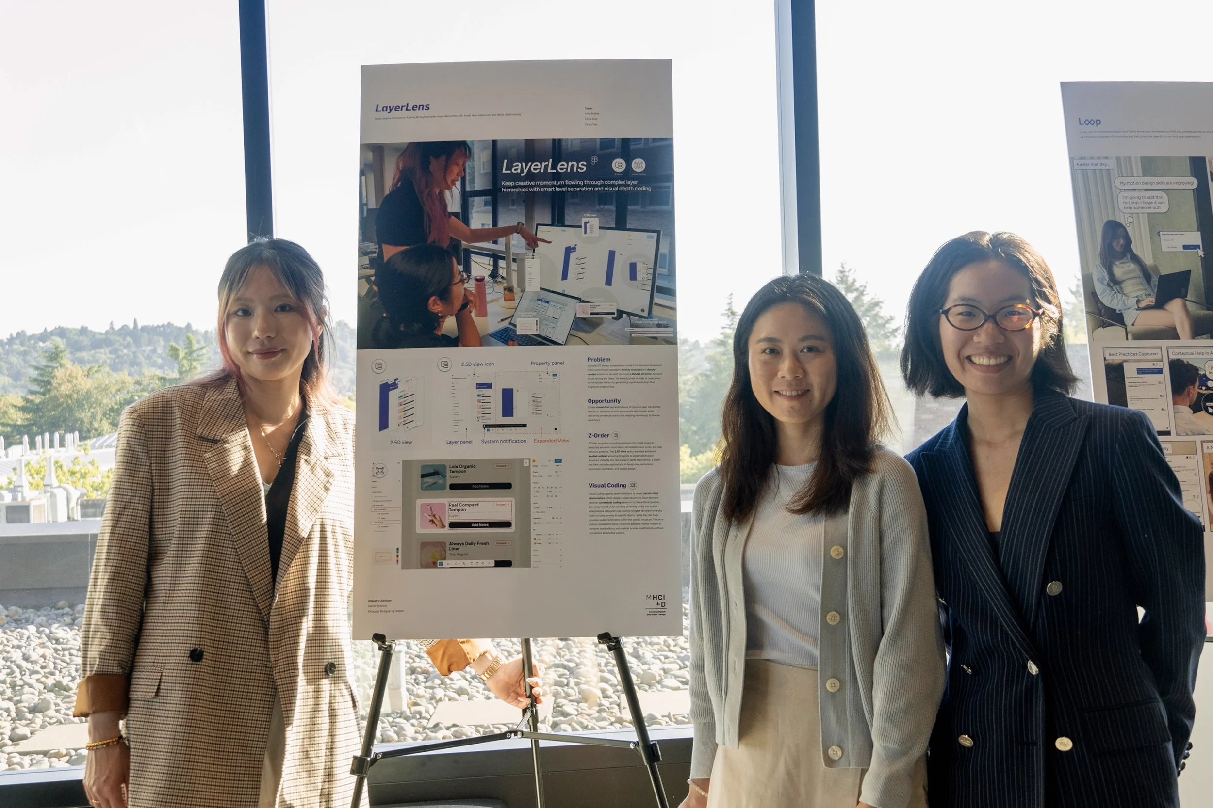
Team LayerLens 💜