Visualizing my dance journey through data
Timeline
10 weeks (Jan-Mar 2025)
My Role
I completed the project proposal, data collection, and visualization designs on my own, with weekly critiques from my professor and classmates.

Context
Quantified Self is the concept of empowering self-awareness through data. I wanted to reflect on my growth as a dancer who posts on social media — from attempting to build a “perfect” presence to embracing and documenting the process.
As part of a design elective, I collected and visualized my own data to reflect on my dance journey.
Deliverables
I created an interactive narrative by delivering 8 types of information visualizations via Instagram posts and stories.
Impact
I centered my growth beyond engagement and reach and reflected on my skills, style, and mindset, enabling deeper introspection and self-compassion. In the dance community where we could easily be harsh on ourselves, this narrative could spark dialog around creative progress, encouraging each other to embrace growth over perfection, in their own pace, and as an ongoing and shared process.
A narrative lens into an Instagram account
I’ve been posting dance content on Instagram for nearly 4 years. In that time, I’ve moved cities, explored new styles, joined crews—but dance has remained my most enduring source of joy and means of expression.
I approached this project as a way to reflect on that journey. By treating my dance account as a visual journal, I began building a narrative about how my dance practice and online presence have shifted and evolved—shaped by life events, community, social media patterns, and broader cultural trends.
Rethinking the data
Initially, I planned to rely solely on analytics to represent my “growth”. But as I refined my research questions—centered on personal reflection, creative development, and identity—I realized that numbers alone couldn’t capture the story I wanted to tell.
To better align with these goals, I collected additional qualitative data:
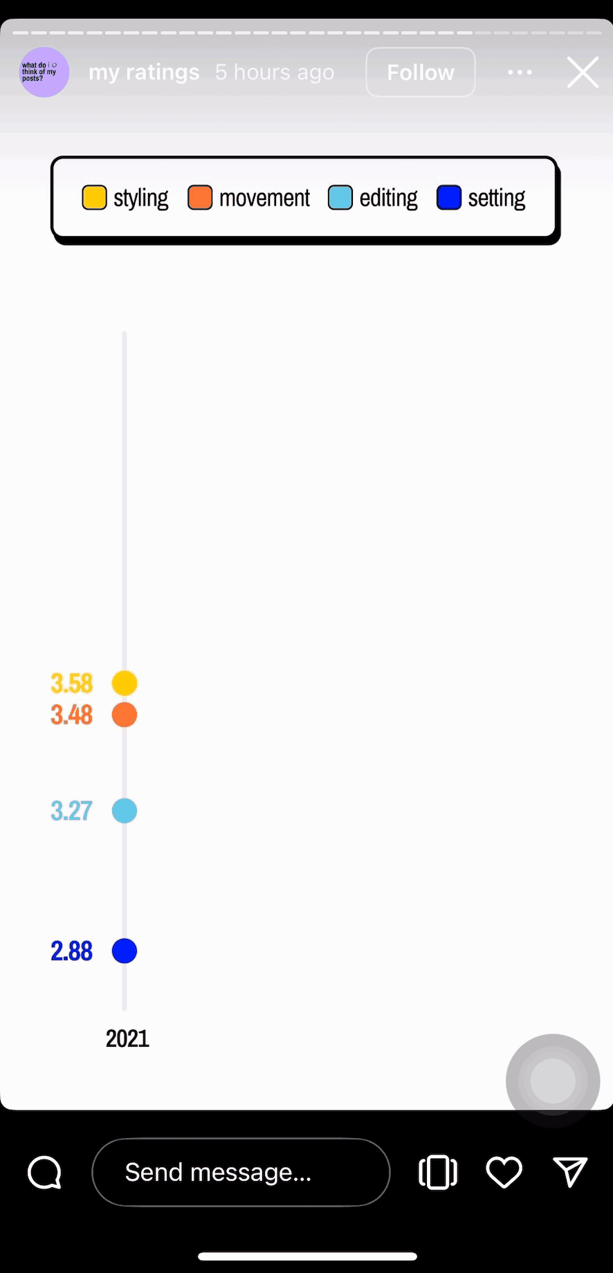
Self-ratings of my posts across 4 dimensions, and
A community survey to gather perceptions of my style.
This pivot allowed me to design visualizations that went beyond metrics and brought forward personal meaning and emotional depth.


Self-rating criteria and scale
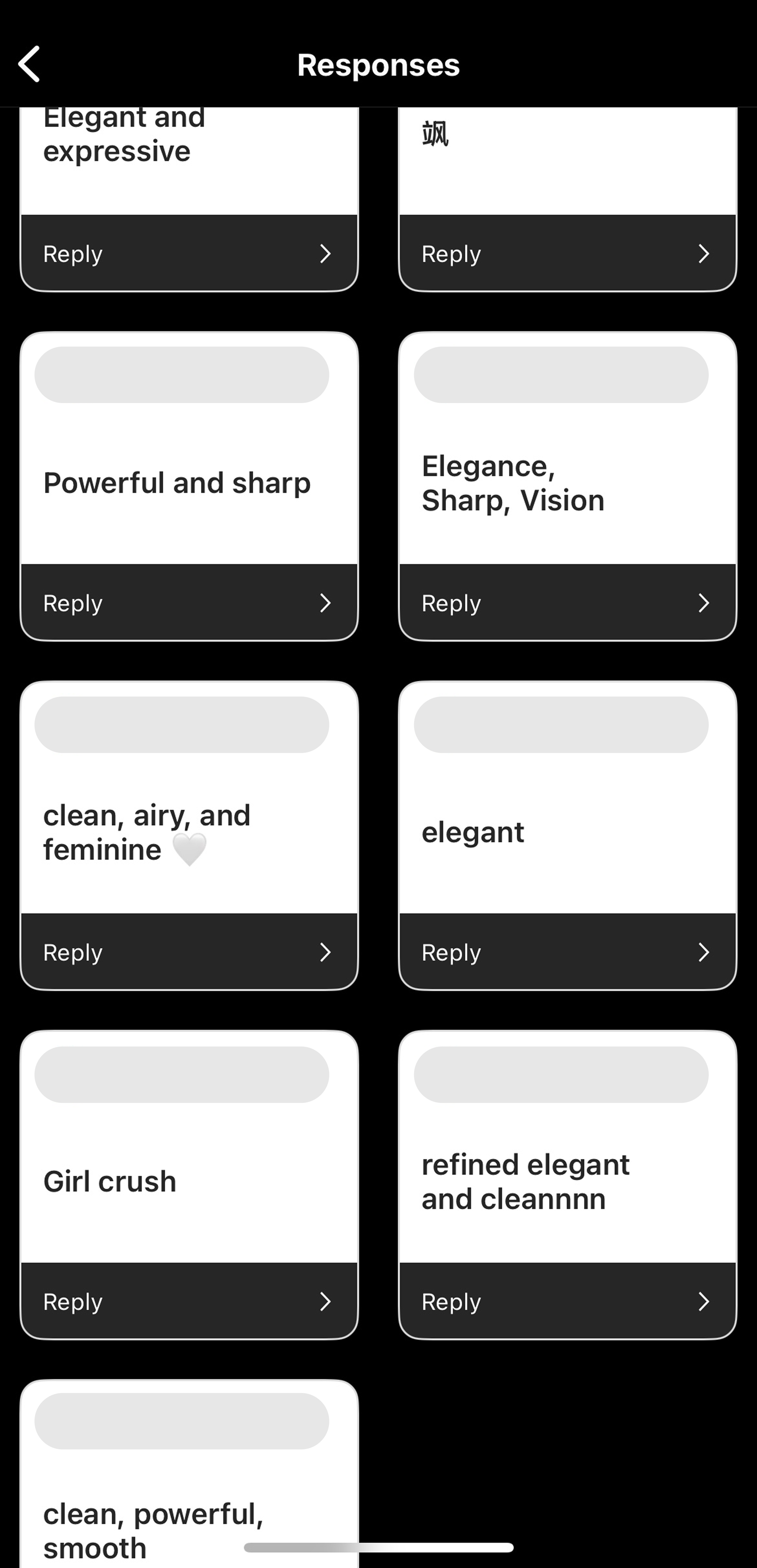

Community survey and responses
Visualizing Instagram, on Instagram
My initial concept followed a linear, scrollytelling structure showing how my growth unfolded across personal, community, and global lenses. But it felt flat and lacked something essential: a reason for the audience to care.
Since I was analyzing my dance Instagram, I decided to use Instagram itself as the medium. I could reflect in the same context where my growth unfolded and meet my audience where they already are.
This came with design constraints:
Short attention span with little opportunity for motion design
→ Rely heavily on sequencing + progressive disclosure
Less control over story line
→ Lean into annotations to form scattered reflections that eventually form into a whole, just like how we experience growth :)
Before: Linear outline
After: Key visualizations embedded in an Instagram profile
Pacing the story for the feed
Rather than requiring the audience to zoom in and interpret a complex chart in an unfamiliar context, I used Instagram’s format to my advantage and designed the reading pace intentionally. I revealed the visualizations one tap at a time to invite the audience to share my experience together.


Breaking the matrix down into two isn’t quite enough…
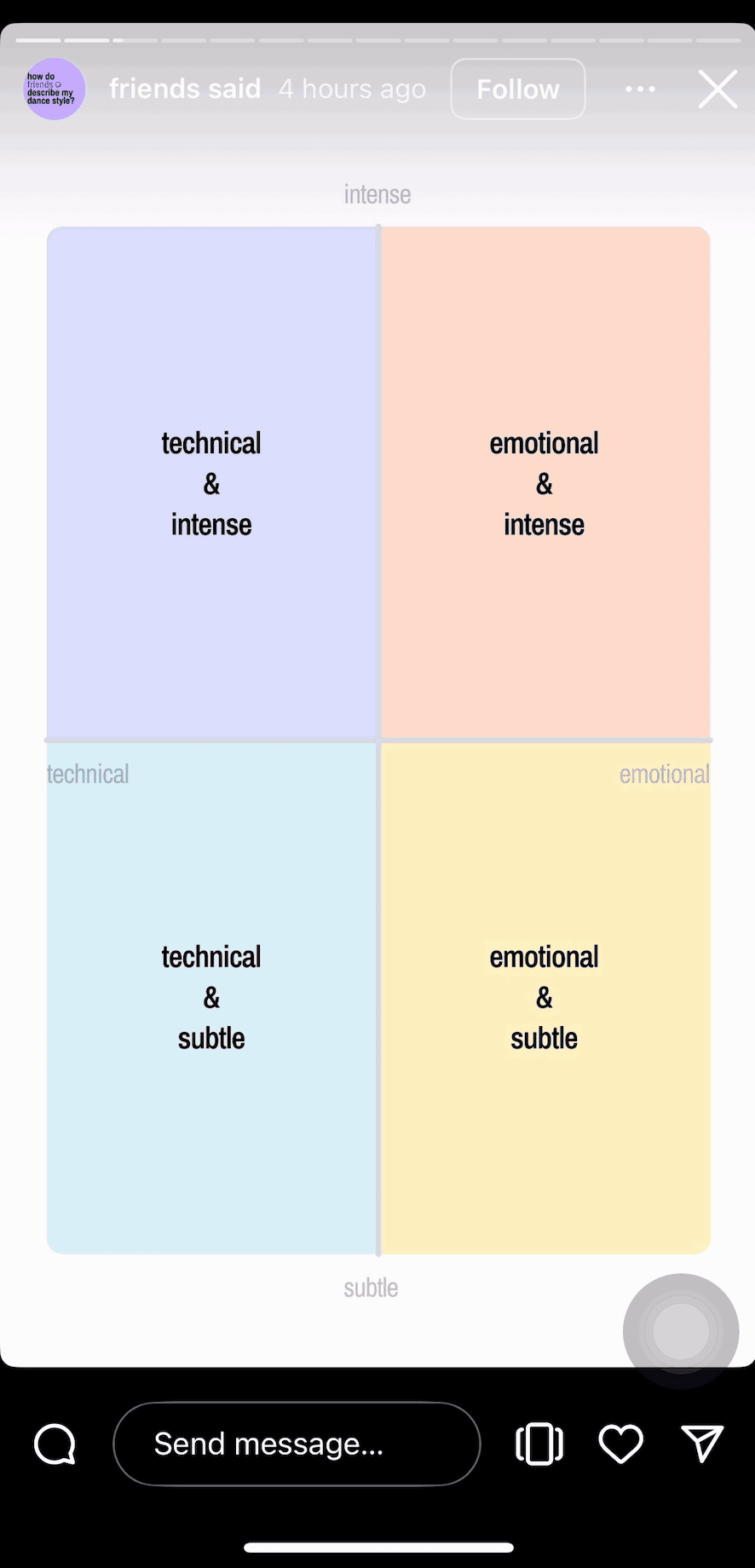
Progressively introduce axis labels, legend, data points, and annotations
Reflections
Sharing my visualizations on Instagram brought the story closer to where the dancing happened, integrating reposted clips and interactive features in a way that felt natural. The platform’s limitations around motion and interactivity pushed me to design with more clarity and pacing.
I learned to present data not just to impress, but to show why it matters. By layering in annotations and context within each chart, I was able to tell a more human story behind the numbers.
If I were to revisit this, I’d love to add microinteractions or voiceover to bring in more emotional textures and reach a broader audience.